Neptune Lines


About
The new look of Neptune Lines had to respect its past and the legacy of the founder, but, above all, it had to respond to the contemporary challenges that a shipping company faces today.
Guided by this direction, we developed an original narrative that emphasizes Neptune’s differentiation from the competition in terms of technological advancement, employee safety, and ecological awareness. Three creative concepts lead to a common message: «We always look forward to our destination, but we never forget what we leave behind.»
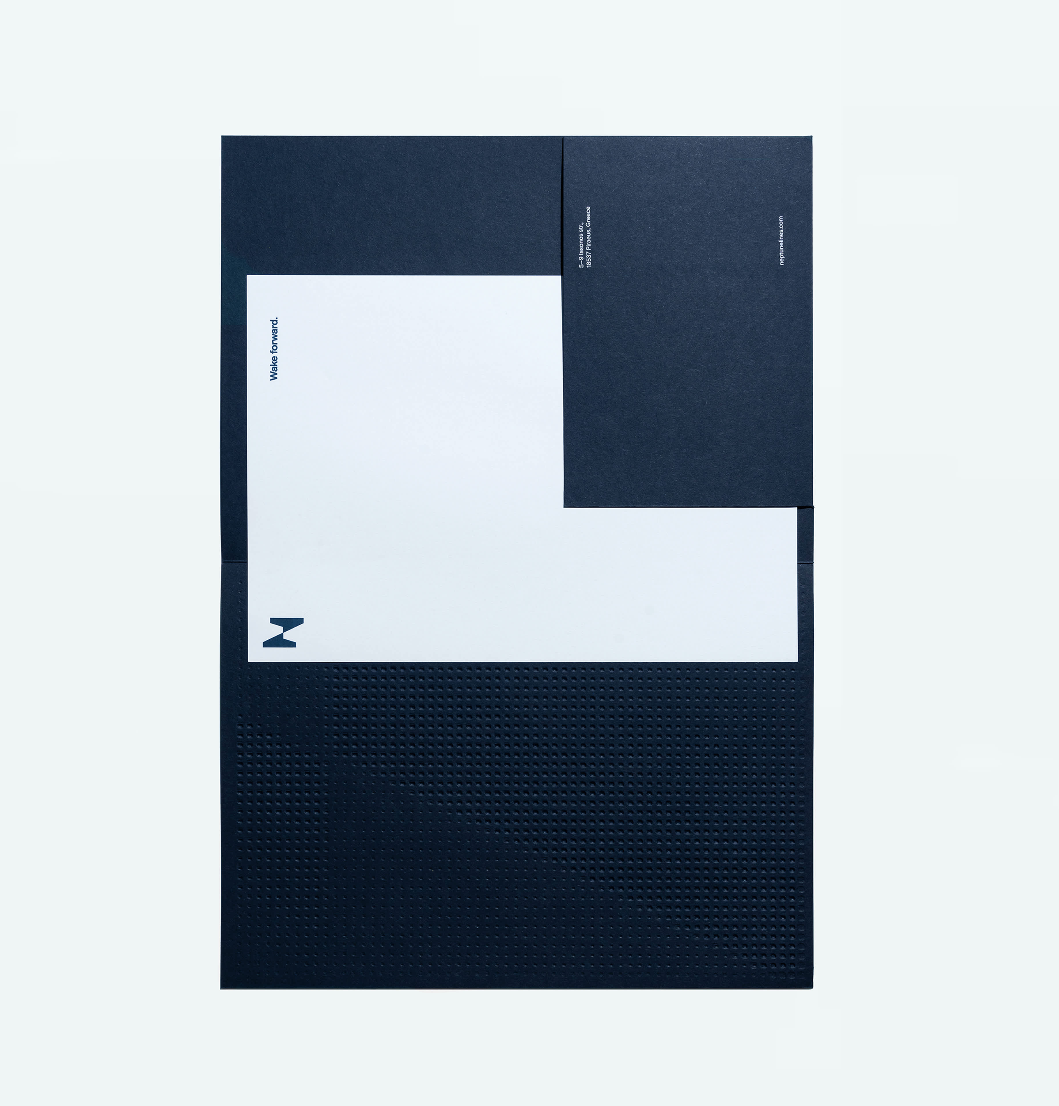
“Wake forward.»
The contrast between the English words ‘wake’ and ‘forward’ sums up our strategy and is the company’s official tagline.
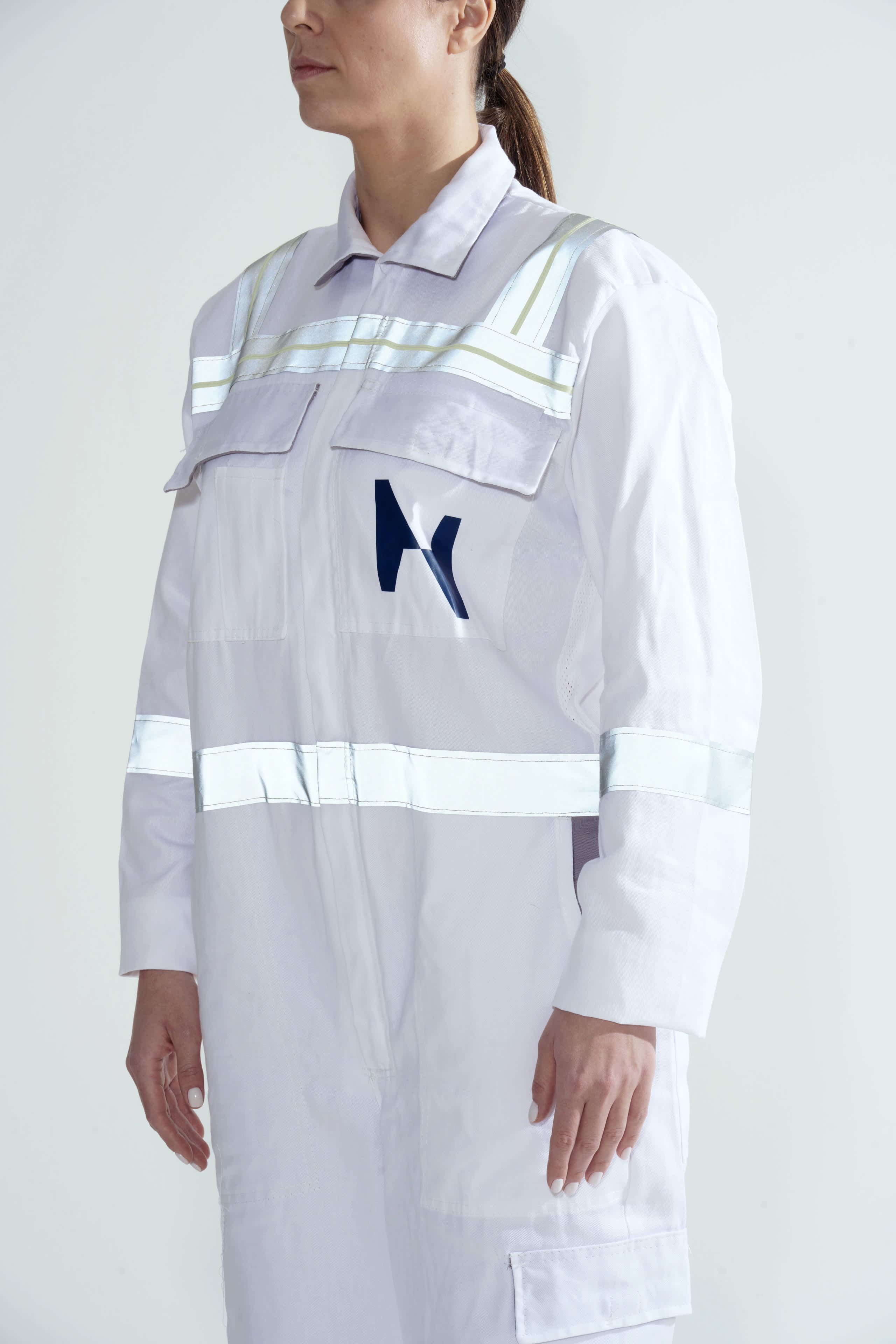
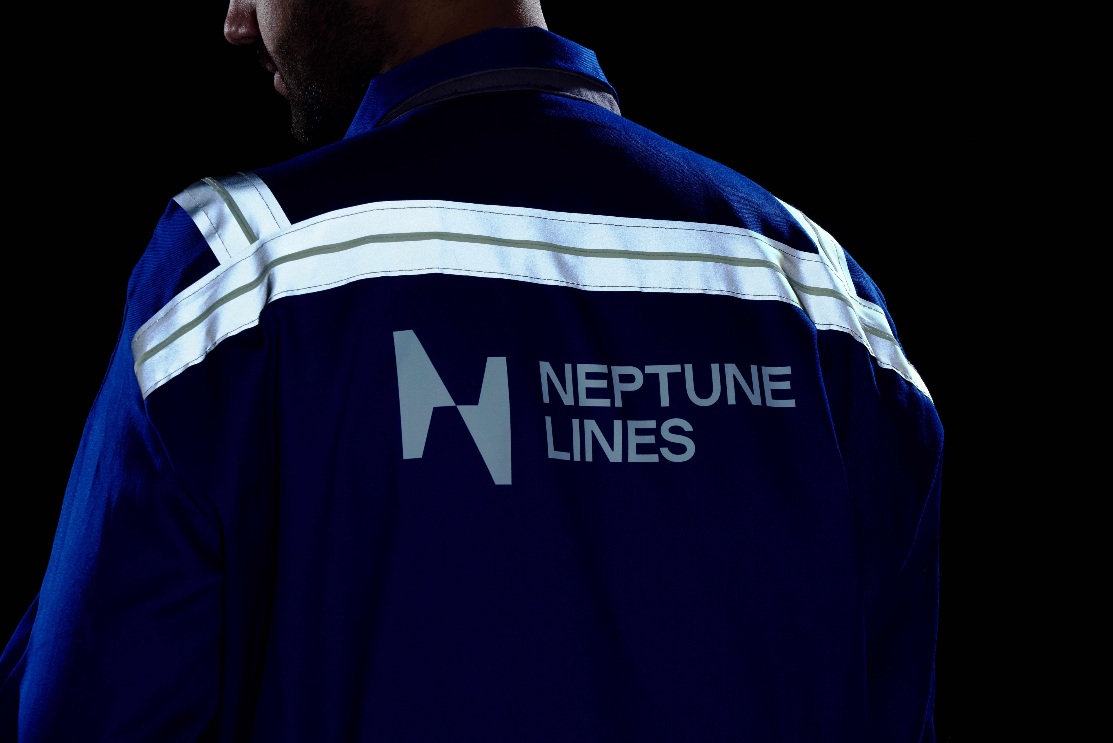
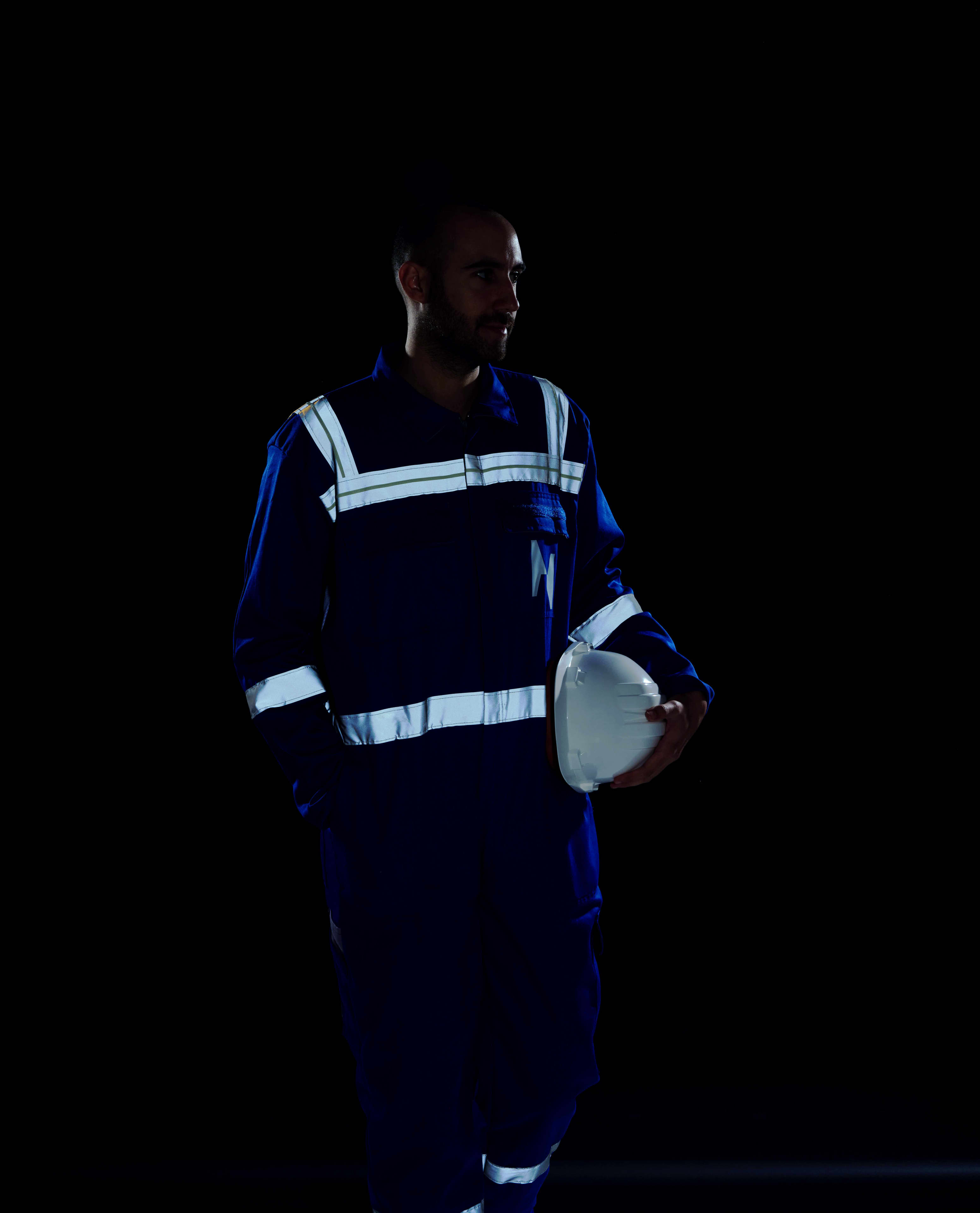
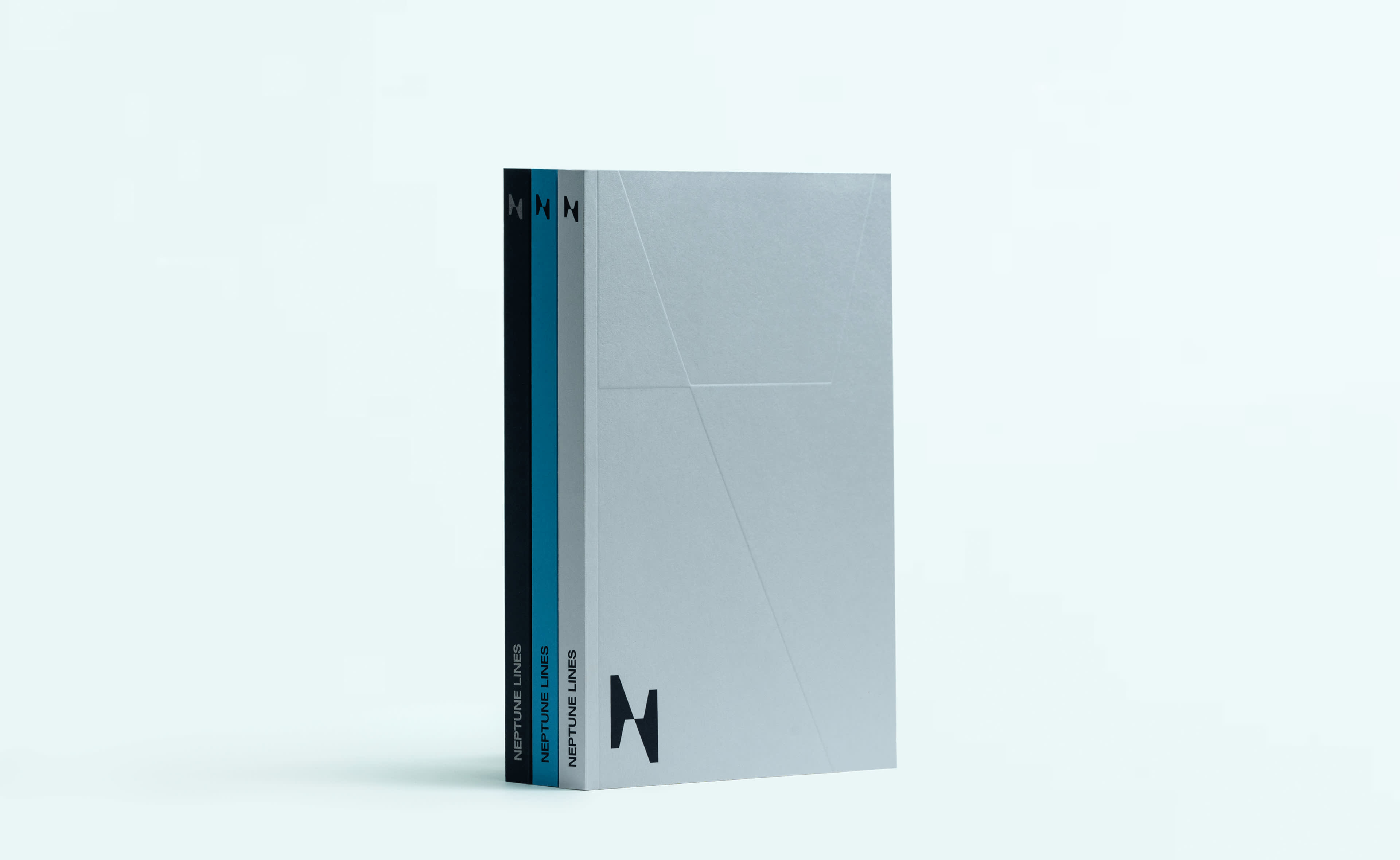
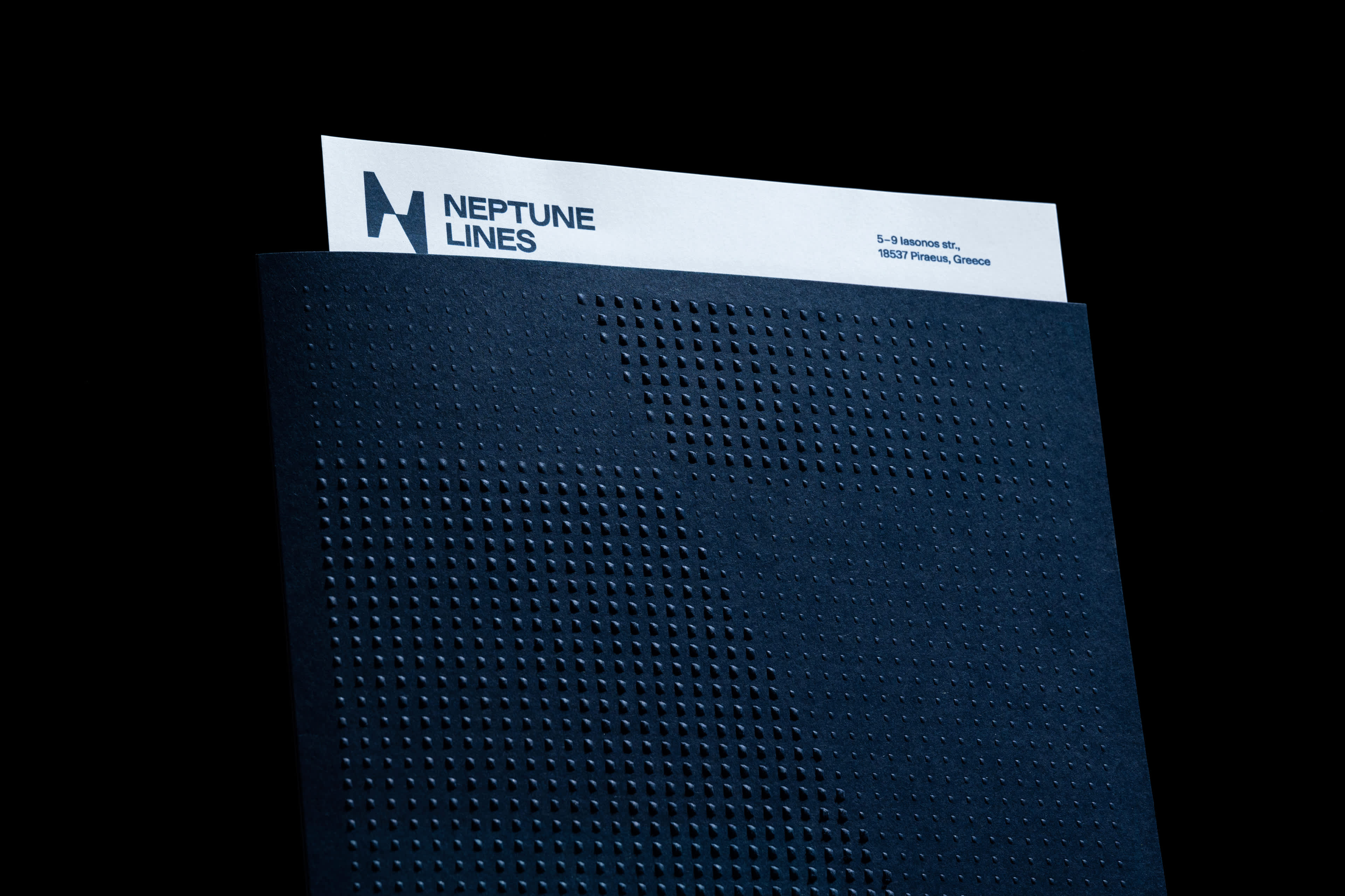
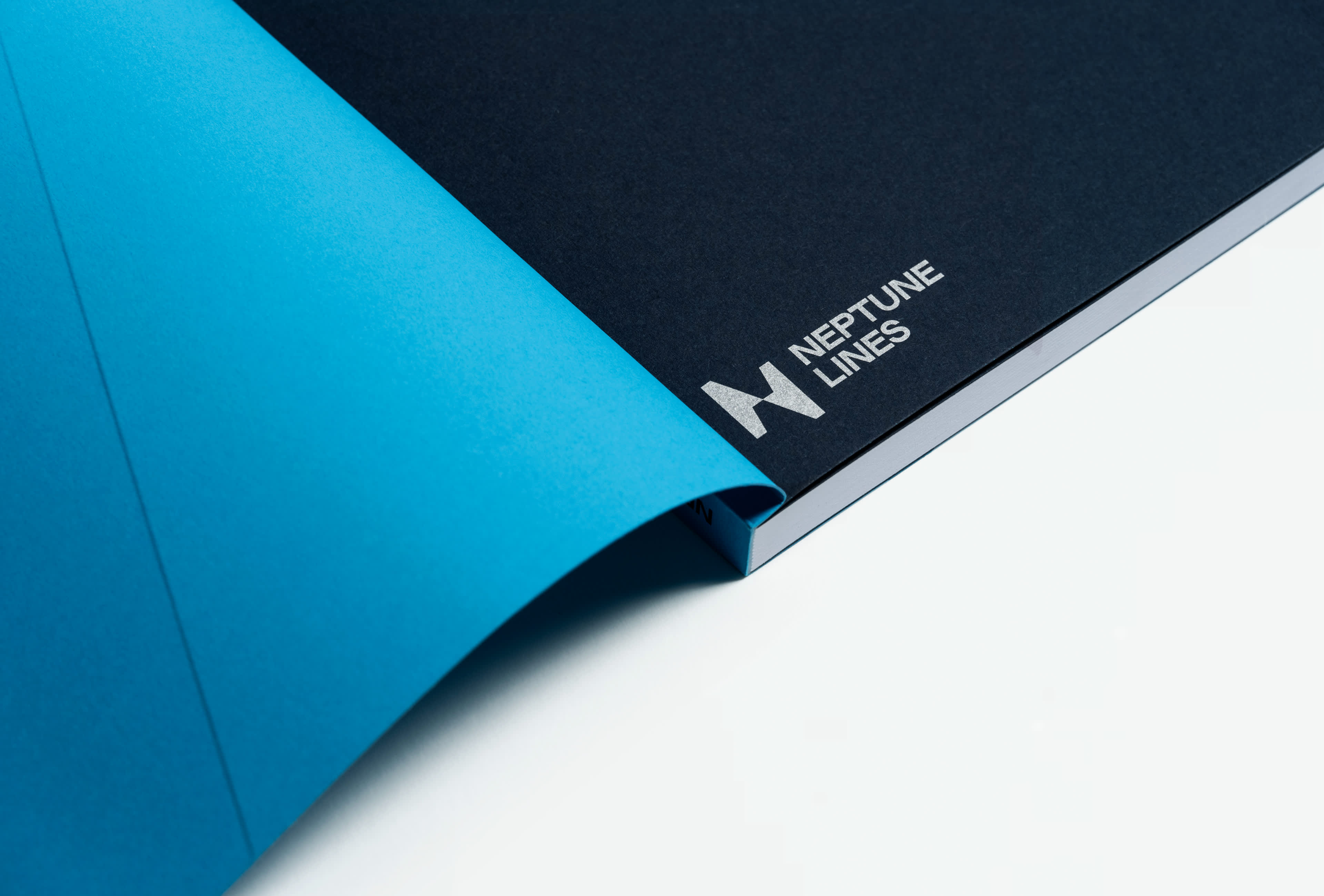
Subsequently, this movement is visually translated into the new symbol, which depicts the intersections of two ships moving in different directions. At first glance, an abstract imprint of the Latin character ‘N’ is created, as a reference to the company’s first symbol.
The logo is completed by a custom version of the Rework font family, from Sociotype foundry. The selected family has a visual connection to the large modern car manufacturers, who are the company’s primary customers.
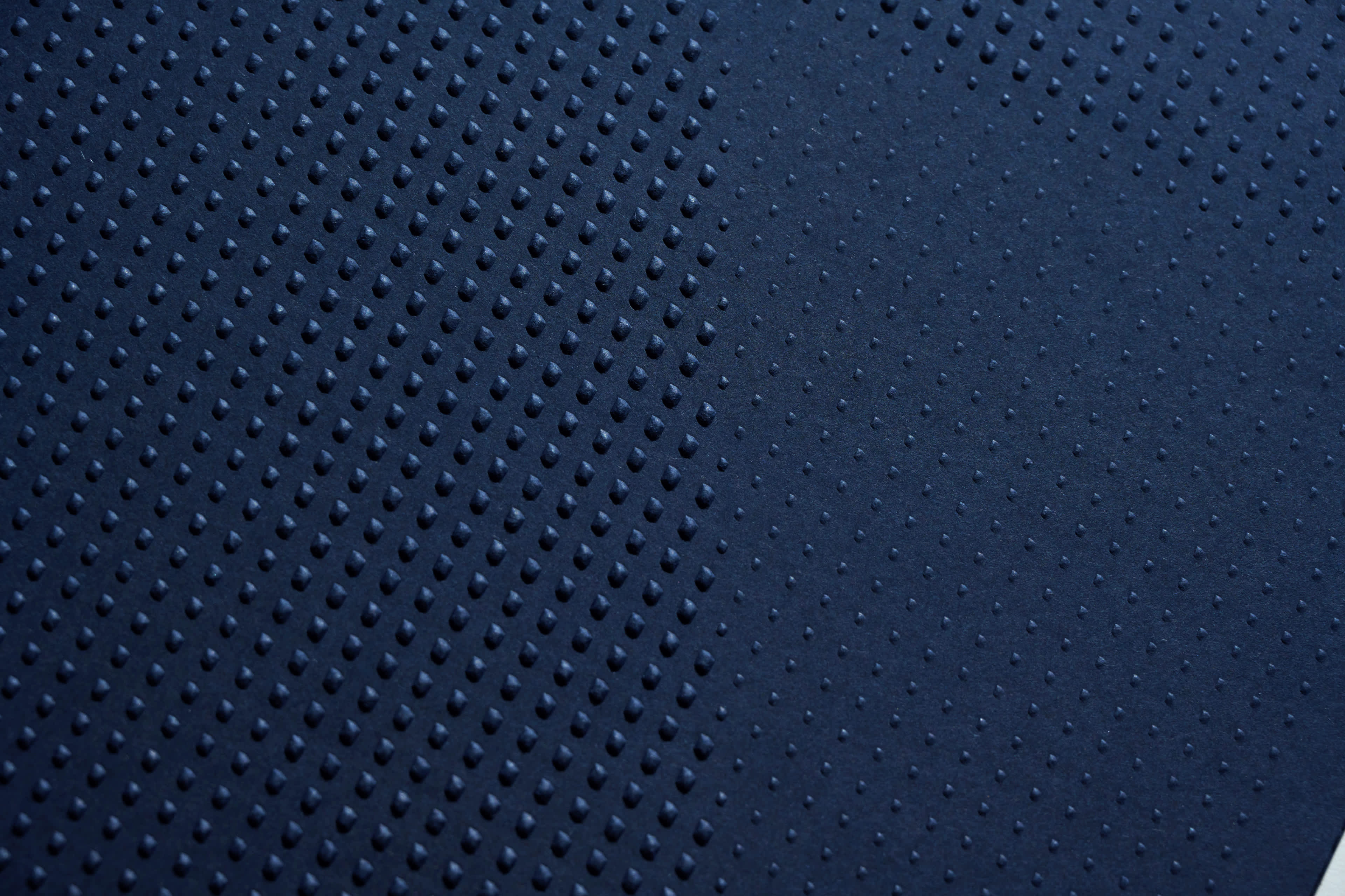
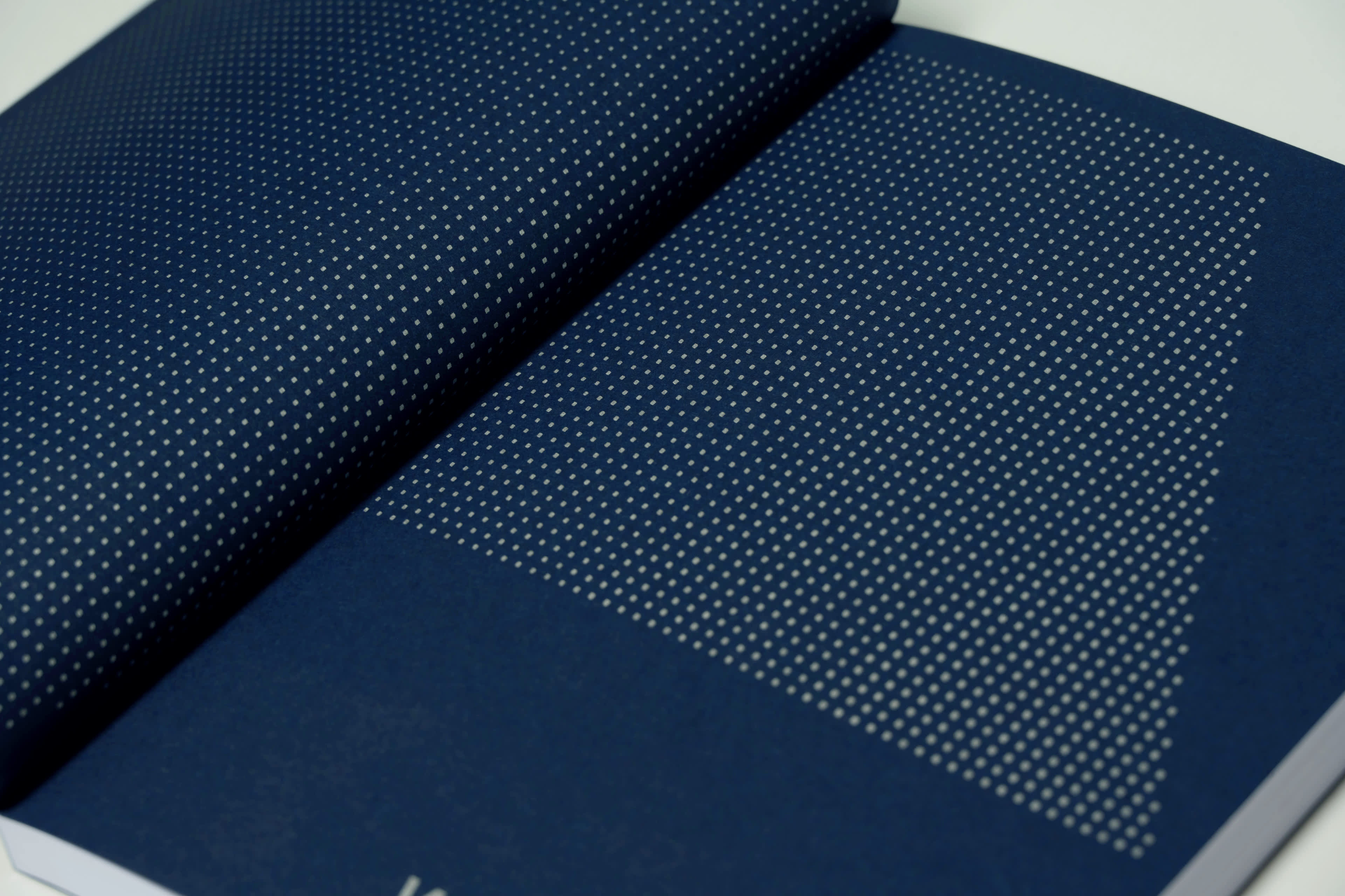
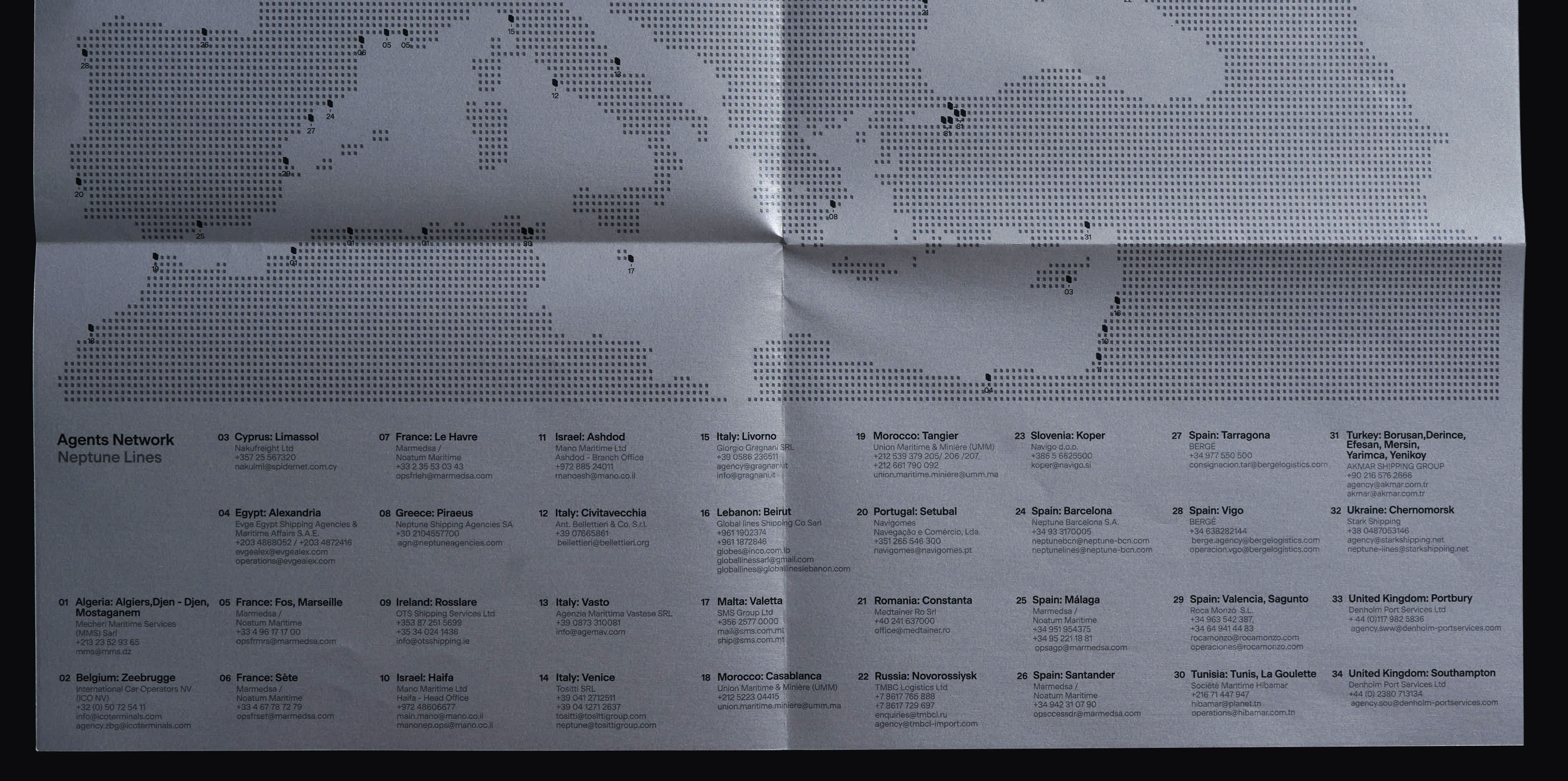
The symbol functions as the first touchpoint with the company and as the ‘matrix’ of a design system, which is born through the outline of the character ‘N’ and is used as an integral part of the identity when designing maps, icons (i.e. pictograms), textures, and photo frames.
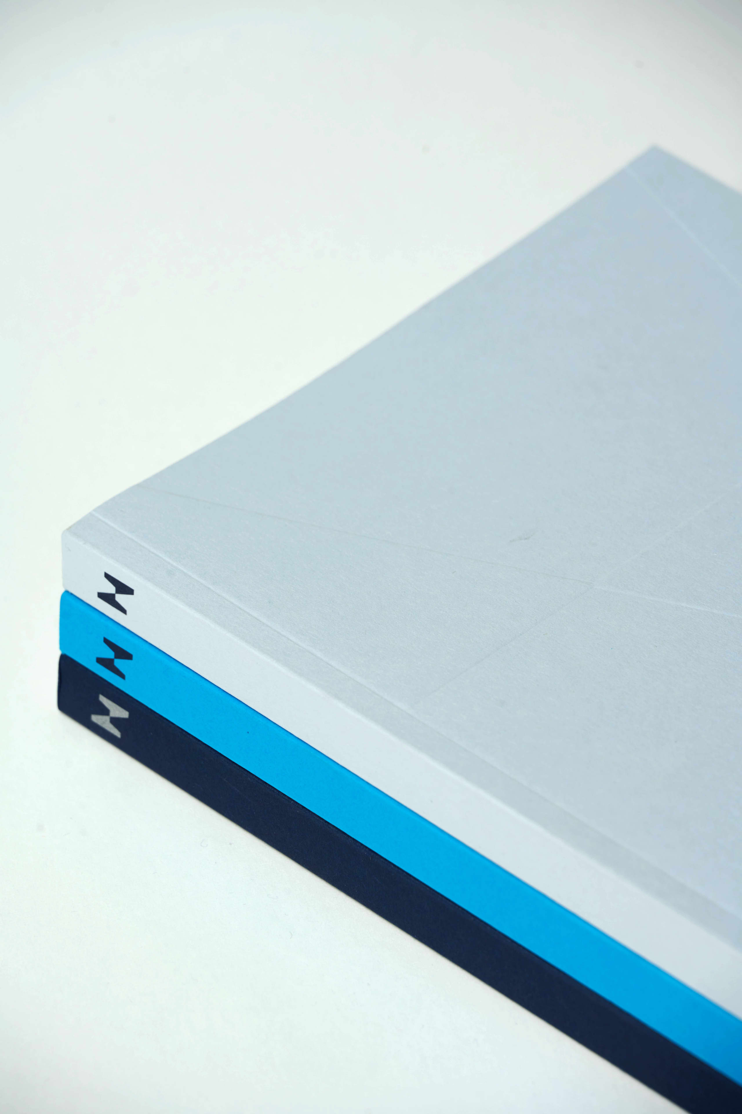
The color coding has evolved from the original version, with navy blue as the primary color, accompanied by an ‘electric’ cyan and tones of grey.
The visual language created to communicate this new era for the company is flexible, contemporary, and ever-evolving, just like Neptune Lines.
Services
Photography